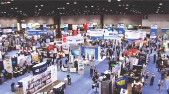
Leveraging Dashboarding for Actionable Insights at a Prominent Exhibition Centre
BUSINESS NEED
A well-known exhibition center sought to use data visualization to better understand global fairs across industries like electronics, consumer products, and agriculture. They needed a streamlined approach to analyze key metrics—such as the number of fairs, industries represented, and attendee and exhibitor data—transforming raw data into actionable insights for strategic decision-making.
METHODOLOGY
The Analytics Arts team developed a customized dashboard solution tailored to the exhibition center’s needs. We started with a thorough data audit to assess the quality and completeness of the existing data, followed by implementing procedures to correct inconsistencies and ensure accuracy. Using Power BI, we designed interactive dashboards featuring key performance indicators (KPIs) such as the number of fairs by industry, geographical distribution, visitor and exhibitor statistics, and year-over-year comparisons, providing a comprehensive view of the exhibition landscape.
OUTPUT
The adoption of the dashboards provided the exhibition center with a clear, data-driven view of the global fair and exhibition landscape. These tools enabled easy analysis of the number of fairs by industry, visitor and exhibitor distribution, and geographical spread. By visualizing key metrics, the center gained deeper insights into its global market position, identifying strengths and growth opportunities. The dashboards also highlighted the most active regions and industries, facilitating informed discussions on strategic planning and resource allocation.


